“One of the important factors behind the fluctuation between bull and bear markets, between booms and crashes and bubbles, is that investor memory has to fail us—and fail universally— in order for the extremes to be reached.” Howard Marks
“The past has relevance, but it’s not absolute.” Howard Marks
“Well, it’s been building up inside of me
For oh, I don’t know how long.” Don’t Worry Baby, The Beach Boys
Although I am a short-term trader, I have always found it interesting to look at long term charts that show stock prices over many decades.
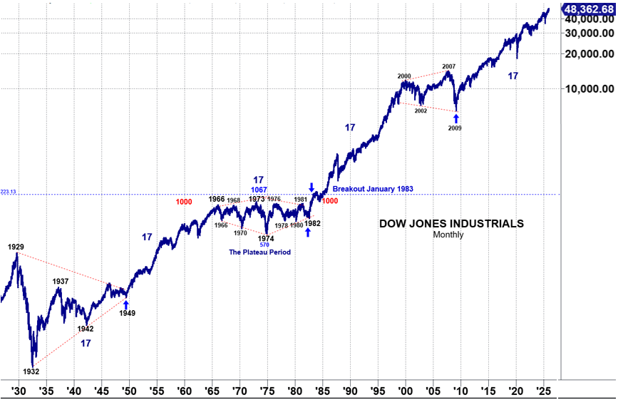
The chart below goes back almost a century. It is a monthly chart of the Dow Jones Industrials on a semi-logarithmic basis. I will go over this chart in detail as it has a story to tell.
Long time readers, have heard me say many times something pertaining to the Long Wave cycle: “every 40 years or so, something BAS happens and every 80 years or so, something REALLY BAD happens.
This pertains to the two periods of debt buildup in the Long Wave cycle. The first period follows the depression that ended the prior cycle. Debt builds slowly coming out of the depression as people remember that it was debt that caused the problem.
40 years after the economic low of 1933, America began its worst recession since the Great Depression. The low of this recession was in 1974 when the DJIA dropped to 570 and sold at near book value. While this was the major low, it wasn’t the end of this ‘BAD’ period. Many argue that it was followed by an even worse recession in 1981-82.
The market again sold at book value; interest rates topped 20%; bond prices dropped to 55; and newscasters mentioned the expectation for a depression.
It was the confirmation of my “something BAD happens’.
While this is interesting history, it brings up some other considerations:
1) That was a long time ago
2) It would not seem we are now due for the ‘REALLY BAD’ part of that equation. The ‘really bad’ part of the equation would be a depression—which would be the result of the second period of debt buildup. This period begins with a relatively high amount of debt already in place….and then grows over the next 40 year period at a parabolic rate. This explains why a depression would be an expectation rather than a surprise to the Long Wave cycle student. Looking at the above chart, we see 1929—the peak of the Roaring Twenties. Three years later we see 1932, the stock market bottom of the Great Depression. As mentioned, ‘the stock market always leads the economy’. The economic low for the Great Depression occurred in 1933 when the banks were closed. The stock market ‘predicted’ this by losing 90% of its value from 1929 to 1932. The DJIA was confined under 200 for about 17 years. In 1949, it launched a dramatic advance into a peak in 1966—another 17 year period. As we move forward, we will see this 17 year cycle continue.
The stock market was then confined below the 1000 level until its breakout in 1983—17 years later. This period is called the ‘plateau period’ where the first 40 year period of debt is ‘digested’.
Note that the DJIA then had another launch point from 1983 to 2000—17u years later. This produced another back to back period of recessions that bottomed in 2002 and 2009 respectively.
This was similar to the 1974 and 1982 recession lows…and even similar to the 1942 and 1949 lows. Note that each of these points are 7 years apart.
Further note that the lows of 1949, 1982 and 2009 were ‘launch points’ for huge 17u year rallies. (I count from the breakout of the ‘plateau period’ in 1983 because that is where the ‘launch’ began).
Note that the 2009 low was the beginning of our current 17 year cycle advance. What is the ‘time’ target year for the top of this advance? 2026!
To me, this is must more compelling evidence that the vast majority don’t want to see because we are to busy making money trading the short term. Which is fine.
It’s the education of a speculator to go long even while being intellectually bearish.
The Long Wave cycle suggests a depression is the next big economic event.
Elliott Wave analysis says that the largest correction since the 1932 bottom is due once the current market tops. Key word being ONCE.
The chart dating back to the prior cycle high in 1929 provides a remarkable visual that shows investors certainly wouldn’t be ‘buying a bottom’ at current price levels—and they just might be buying a top.
Simply put, the chart alone should scare the heck out of any logical investor. When you add in historical input, fundamentals, debt analysis, market sentiment, valuation, the Buffet Indicator…or focus should now be on RISK.
The rub is that as Gann stated, the most money is made at the end of the cycle.
Market tops are defined by optimism and the current market is no exception.
We have seen the indices make new all-time highs.
The financial media is ebullient as well.
Artificial Intelligence is as exciting as the dot.com bubble ever was. We’re just cracking the surface on the potential uses and benefits of Artificial Intelligence. AI appears to have decades of growth in its future.
Sounds a bit like 1929.
The bullish camp has no concerns of the potential for a depression or a revolution. Yet we can see the seeds of potential revolution on the streets of Minneapolis.
But, just because history points to those two potential events as the logical outcome has no bearish on whether it will be the rue outcome.
My point in sharing the historical path is merely for you to have the awareness and to assign your own odds to such potential events.
As well, my goal is to point out the real potential danger.
I’ve mentioned the 25 year cycle before, but it is worth sharing again.
The chart below is a monthly semi-logarithmic chart of the Dow Jones Industrial Average on a closing price basis. The actual cycle is 207 months. The white vertical lines and arrows show where these cycle fall on the chart.
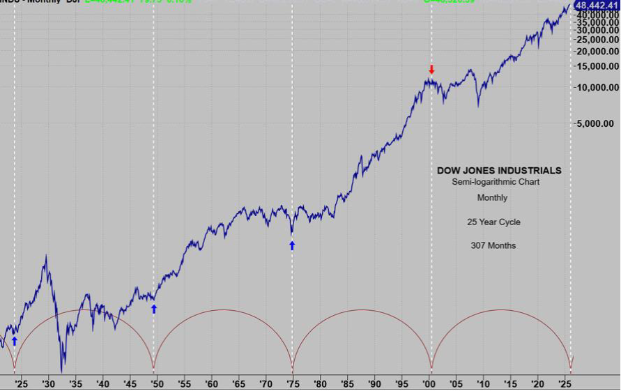
In every case, beginning in October of 1923, price has had a substantial move in the direction show by the arrows.
The first 3 hits launched huge up moves. The 4th hit was at the dot.com bubble top.
When is the next hit? February 2026.
Many factor indicate we are very late in this cycle and at a dangerous point.
But bull markets take a long time to complete. Part of the reason for their lengthy tenure is that ‘smart money’ needs to sell to you.
Smart money as a food feel for when things are getting extreme. They buy when stocks are hated and sell when stocks are loved.
The volatility and backing and filling (aka distribution) at tops is to create a lot of buying volume so they can dump their shares without us noticing.
Big bull markets end in this manner: 1929, 1987, 2000).
Above I mentioned the 307 month (25 year cycle).
On the Square of 9 Wheel 307 (purple) is straight across and opposite February 4 (red).
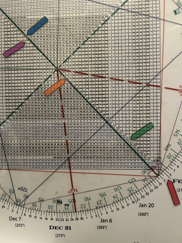
Now because we’re talking about 307 months, the entire month of February is the “bulls eye” not necessarily the specific date of Feb 4.
That said 307 is a corner number (natural power) and it aligns with 381 (blue), the DJIA closing high in 1929.
It vectors 1982 (orange) the year when this longest of all bull markets started… 43 years ago (green).
Got geometry?