“She could steal but she could not rob.” She Came In Through the Bathroom Window, The Beatles
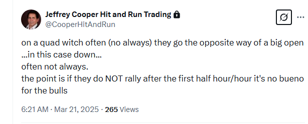
All bear markets start with a correction, but not all corrections turn into a bear market.
The trick of the trade is to separate the bear wheat from the bull chaff.
The phase “separate the wheat from the chaff” comes from the Bible referring to the Messiah’s judgment separating the righteous from the wicked.
This is very apropos as we’ve seen some very wicked price action and some very righteous rallies and reversals in just a month.
How is one to know if it’s a correction or a bear market?
The market “knows what it cannot say”…at least clearly.
It’s job number one is to deceive.
But it leaves clues at the scene of the crime, like every culprit.
This week we’ll be detailing what we’ve used over the last few decades to determine the trend.
Keep in mind that there is a Primary, Intermediate and Minor trend all playing out concurrently.
In this report we will look at Price in its relation to Time versus cycles which we will cover later this week.
The market telegraphs its intentions by its price action but the message isn’t unequivocal.
For example, I use the 3 Week Chart, which integrates Time and Price.
Let’s look at the efficacy of the 3 Week Chart starting from January 2022, the top preceding the last bear market in the SPX.
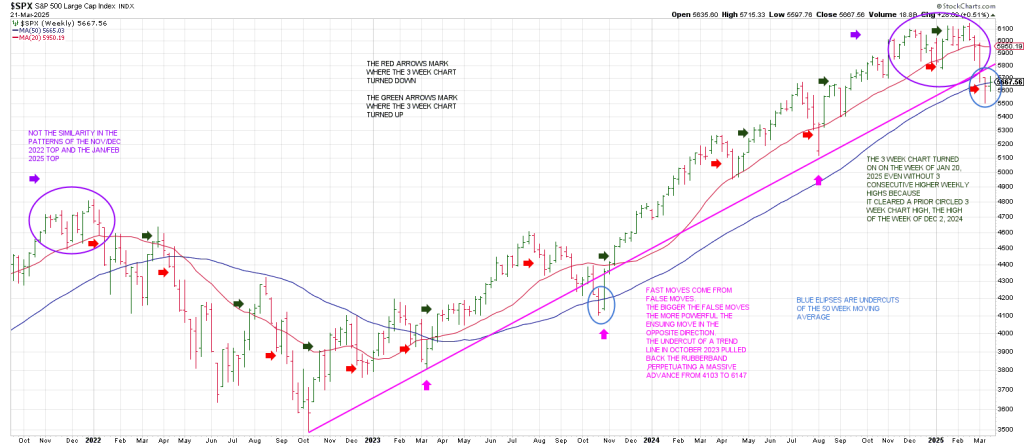
Before we walk through the 3 Week Chart pivots, I want to make some observations about what we can learn from the above chart.
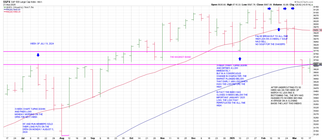
1) Notice the similarity of the pattern of the 2022 top to the 2025 top (purple ellipse). Both tops show weekly Soup Nazi sell setups (a specific false breakout pattern I developed_.
2) The blue ellipses mark the only times the SPX has undercut its 50 week moving average since reclaiming it and carving out an inverse right shoulder in March 2023.
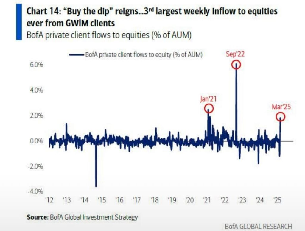
The bulls of course are hoping for a repeat performance. As we showed last week the Buy The Dip conga line was in full swing last week plowing money into the market.
Don’t buy into the thinking that everyone is bearish. It ain’t true. If you’re a contrarian trader this is a come to Jesus moment.
Apparently many traders are “sucking their thumb in wonder”
3) Fast moves come from false moves. It follows that the bigger the false move, the more powerful the ensuing move in the opposite direction. To wit, the false break of the rising trend line in October 2023 pulled back the rubber band perpetuating a massive advance from 4103 to 6147.
When the 50 week was recaptured in tandem with the magenta trend line, the bulls had filed position.
In order for the bulls to capitalize on the current situation, they must reclaim the 50 week and hold it and then convert the broken magenta trend line at 5800 ish.
From my perspective, the structure of the market and cycles argue that Friday’s reversal is part of a countertrend rally, a Wave 2 corrective rally that will meet resistance below 5800 ish.
We refine exactly where and when the most likely short term and intermediate resistance will be on this morning’s Hit and Run Private Twitter Feed.
On to the play by play of the 3 Week Chart starting with the January 2022 top.
The 3 Week Chart turned down directly off its Jan 2022 high, skidded a little lower on the 4th week down, but closing on the high on the week of Jan 24th.
The Weekly Swing Chart turned up, on the week ending 1/31/22, ie the SPX produced a rally above the prior weeks high.
That was all it could muster before turning back down.
Notice that the rally was rejected from the overhead 20 week moving averge.
The 3 Week Chart finally turned back up on the week of March 28th.
Again in the region of a now declining 20 week moving average.
When the trend is down, a turn up in the 3 Week Chart will define a high soon, in terms of time and price.
When the trend is up, a turn down in the 3 Week Chart will define a low soon, in terms of time and price.
My Swing Chart Method is one of the best methods I know of to separate the trend wheat from the trading chaff and interpret Mr. Market’s intentions.
This is because the Swing Chart Method integrates Time and Price.
But as we will see as we continue to look at other time periods throughout this week, even the 3 Week Chart method must be backstopped by other methods.
Notably, after the SPX 3 Week SPX Chart turned back up in late March 2022, it immediately turned back down on the week of April 18.
This is the Sign Of the Bear.
The immediate turn down of the 3 Week Chart after turning back up in late March saw the market get hit hard.
The index dropped with authority into mid-May, 7 weeks from the late March pivot high.
It was a 7 week mini crash with the SPX falling from 4637 to 3810..a 827 point, 18% decline in 7 weeks.
A similar decline today projects to 5041.
Remarkably that ties almost exactly to the August 2024 Flash Crash low of 5019.
Think about that. Despite the blood on the street, in the current SPX sell-off, counting from the PRIMARY HIGH on January 19th, the SPX has declined approximately only half of what it did in the middle of the 2022 downdraft.
I bring this up because the Gann Panic Window culminates between the 7th to 8th week from extreme high.
I have been using the January 24 peak as a Primary High to project a panicky decline in keeping with the Gann Panic Zone…which has paid off stunningly on the short side for Hit and Run members.
However, as noted last week, it looked like the SPX carved out a near term oversold low on the turn down of the 3 Week Chart on the week of March 10th, the week before last.
Amazing.
The turn down of the 3 Week Chart defined a low.
I went on to say last week that. it may be that we have to consider taking the count from the actual price high of February 19th to project when the Gann Panic Zone will exert its downside influence.
The panic window counting from January 24th closed Friday.
While Friday had the makings of a waterfall decline with a gap down of near 50 points, it morphed into a reversal day, closing green.
It backstops the idea of that the C Wave of an A B C countertrend rally is on the table.
The A Wave rally played out from March 13 to March 17th.
The B Wave pullback played out from March 17 to Friday, March 21st.
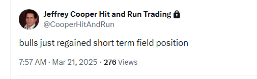
As we tweeted on the Hit and Run Private Twitter Feed, the bulls regained short term field position Friday morning.
They capitalized on it.
Despite Friday’s potentially bearish setup, we were taking several long trades on Friday such as RDDT and TEAM.
Let’s return to the 3 Week Chart study.
We got two consecutive higher weekly highs on the week of May 30th 2022, producing a weekly Minus One/Plus Two sell setup.
The SPX dropped to a new low for the move in June.
From there a rally phase played out with the 3 Week Chart turning back up on the week of August 1, 2022.
The market extended for another week before rolling over to a new low undercutting the June low.
Notice that the 3 Week Chart turned back down on the Week of September 5th which perpetuated a rally leading to another weekly Minus One/Plus Two sell setup on the week of September 12th.
From the October 2022 low the 3 Week Chart turned up immediately.
The important thing to notice is that not only did it push higher, but that the first subsequent turn down of the 3
Week Chart defined a low from which the 3 Week Chart turned up again.
Each time the 3 Week Chart turned down from that juncture, a low was defined soon in terms of time and price.
There was a change of complexion in the summer of 2023.
The SPX 3 Week Chart turned down on the week of August 14.
It had a knee-jerk reaction rally but when the low of the week of August 14 was violated it opened the door lower.
The SPX continued lower into October.
From the October 2023 low, the 3 Week Chart turned up with momentum.
When the turnup occurred on the week of November 13, the SPX sped ahead.
The market was talking.
The SPX continued higher and the 3 Week Chart remained pointing up until April 2024 where it turned down.
The turn down defined a low and the 3 Week Chart immediately turned back up.
Bullish action.
The 3 Week Chart turned down again at the end of July 2024.
It gapped down on Monday of the following week, August 5th and closed at the high of the week leaving a signal reversal bar.
The 3 Week Chart turned up as soon as it could off the August 5th low—in other words on the 3rd consecutive week off the low.
The 3 Week Chart turned down once again on the week of the election in early November and exploded immediately to the topside leaving a large range outside up week.
A similar pattern was repeated on the week of January 13,2025.
The 3 Week Chart turned down followed by an immediate upside explosion on week 3.
The SPX struck a new record high on the week of February 17th following which the SPX turned its 3 Week Chart down immediately.
The pattern is reminiscent of the Flash Crash in early August.
As Gann stated, “As above, so below.”
The turn down of the 3 Week Chart defined as low on the week before last with the index turning its Weekly Swing Chart up fractionally last week on trade above the prior weeks high.
This is the normal expectation as occurred off the top in 2022.
The difference between the current decline and the August decline is that the SPX tested its 50 week moving average two weeks ago and is attempting to reclaim it.
The August low never violated its 50 week ma.
Likewise in October 2023, the last time the SPX tested its 50 week moving average, the index undercut it and reversed sharply.
Unless we see momentous momentum back above the 50 week ma, the market is suspect.
This is where the rubber meets the road.
We must be mindful that counting from the February high puts a possible waterfall decline just ahead after more of an oversold bounce perhaps.
Breakage below the “circled” 3 Week Chart low at 5504.65 produces a Time Turn Trend sell signal.
Essentially, this means that the 3 Week Chart turn down is not acting as support confirming lower prices, as was the case in the summer of 2023,
Tomorrow’s report will examine the message of the 3 Week Chart from 2020.
In sum, an oversold bounce could see the SPX retrace to a band of resistance from 5775 to 5875.
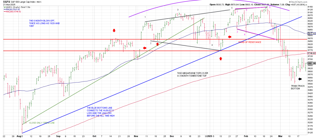
Notice however that this band is just above the 200 day moving average.
The SPX will have to convert the 200 day before it can even attempt to push into this well-defined band which defines the bottom of a Tombstone Top.
Notice that the Tombstone Top itself is comprised of TWO Megaphone Tops..
The inflection points marked by the red arrows proves the significance of this region…the bottom of which is the 200 DMA and the top of which ties to the declining 50 DMA.
Mr. Market has its work cut out for it if it wants to open the door higher.
1) The structure looks like a Wave 1 decline with the index working on a Wave 2.
If so, then the next leg down will be a powerful Wave 3 decline consistent with the Gann Panic Window counting from the February peak.
2) A Bottoms Line (blue) from the August low defines the trend break below the 50 day moving average in late February. Notice that following a backtest of this Bottoms Line and the 50 dma we got accelerated momentum to the downside on March 3.
I would not be surprised to see similar downside momentum develop following a backtest of the 200 dma this time around in tandem with a backtest of the Maginot Band of resistance AND the declining 20 day moving average which has not been tested since the SPX broke down on February 21st.
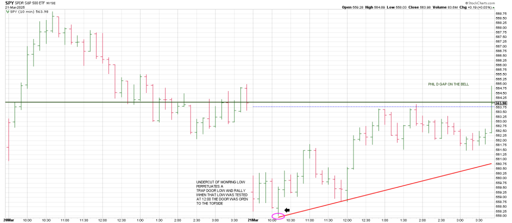
In sum the SPY came in thru the bathroom window from nowhere late Friday— running to 564.89 perfecting a Time/Price square-out”.
564/565 squares out with Friday/today.
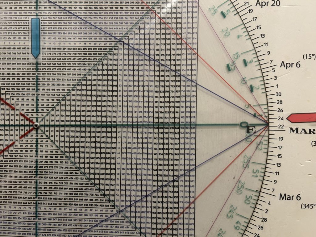
It was an Opex Pinball for the books…with the SPY undercutting the 560 strike only to reclaim it to push to 565 just before the bell.
The Option tail wags the market dog
In the banks of the Fed’s lagoon.
Trade on Monday above last weeks 5715.33 high, a square-out flagged at the time on Wednesday will put the SPX in the weekly Minus One/Plus Two sell position.
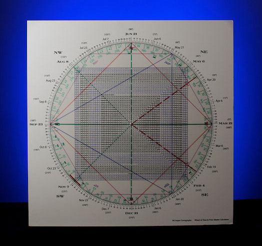
Square of 9 Wheel
Purchase your own Square of 9 Wheel. Shipping to US only. Contact Jeff for shipping outside the US.
to order a Square of 9 Time/Price calculator go to cooperhitandruntrading.com
and consider a membership to support our work.
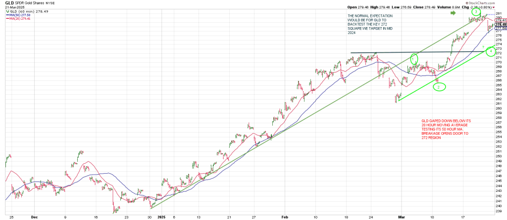
GLD update